Gap Icons. An essentials Guide.
Art Direction | Digital Design | Experience Design | UX & UI
A cohesive design system across gap icons. Everything you need to know about our essentials. Helping the customer understand the differences, find their fit, and make it their own.


Women’s Denim Guide
See it live>
Men’s Denim Guide
See it live>

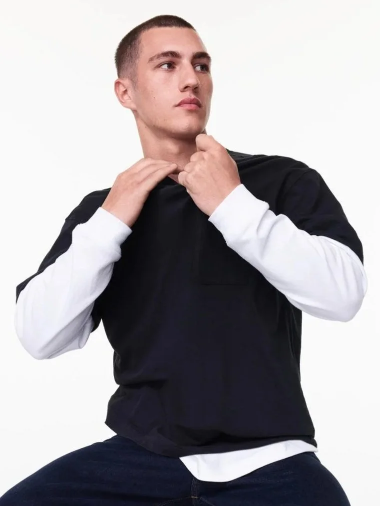
Women’s Tee Guide
See it live>
Men’s Tee Guide
See it live>
The Experience
Designed for discovery.
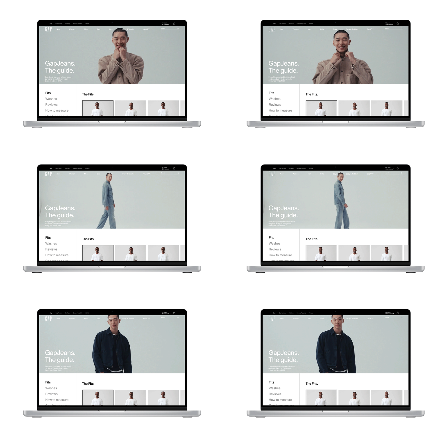
With expanding areas and best in practice UX UI design these pages were built to explore and learn more. With all guides Medium scroll depth averaged 85%.
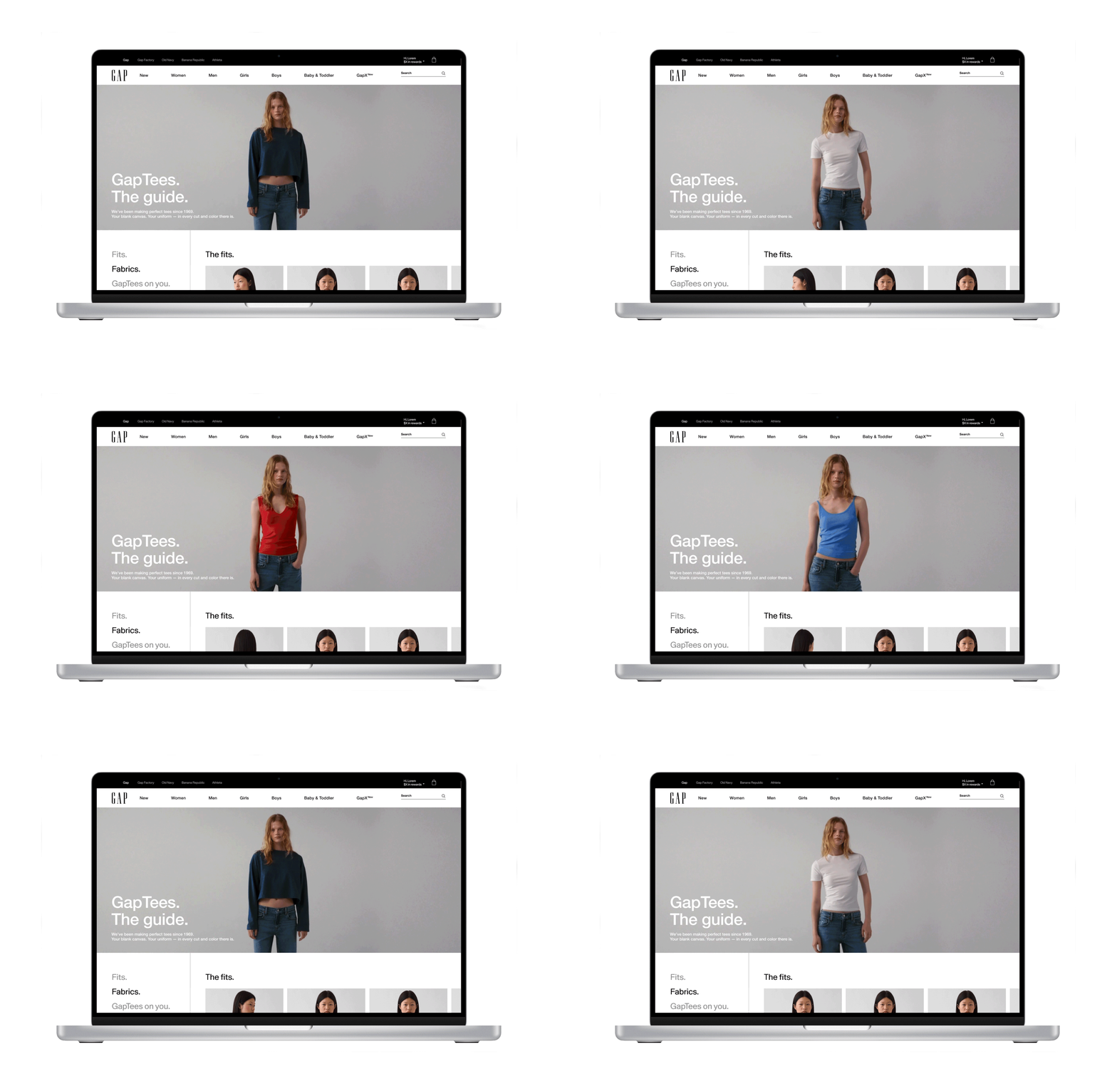
A guided journey from exploration to purchase.
The Strategy
A modular experience that educates, inspires, and converts
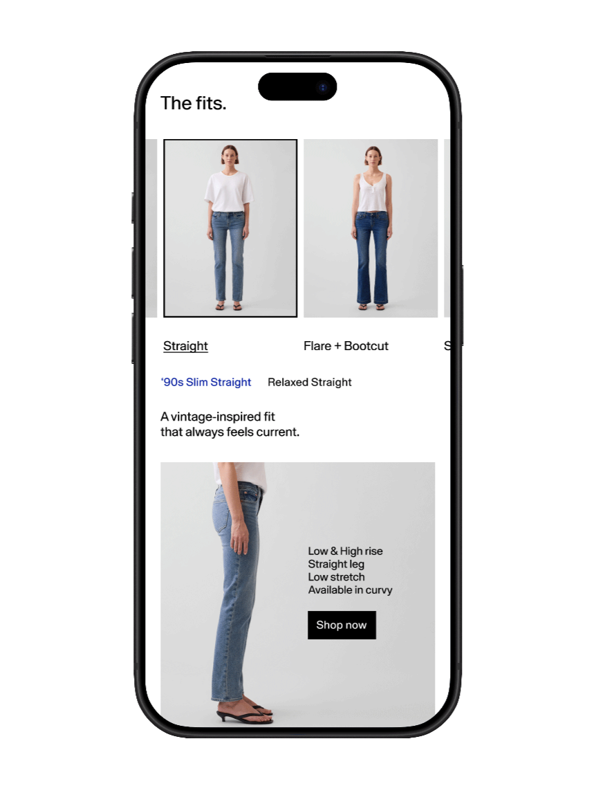
Compare, fit, rises, color & silhouette with consistent design & motion.
1) Find your Fit.
2) Get inspired.
Stylized looks and ideas that bring the product to life.
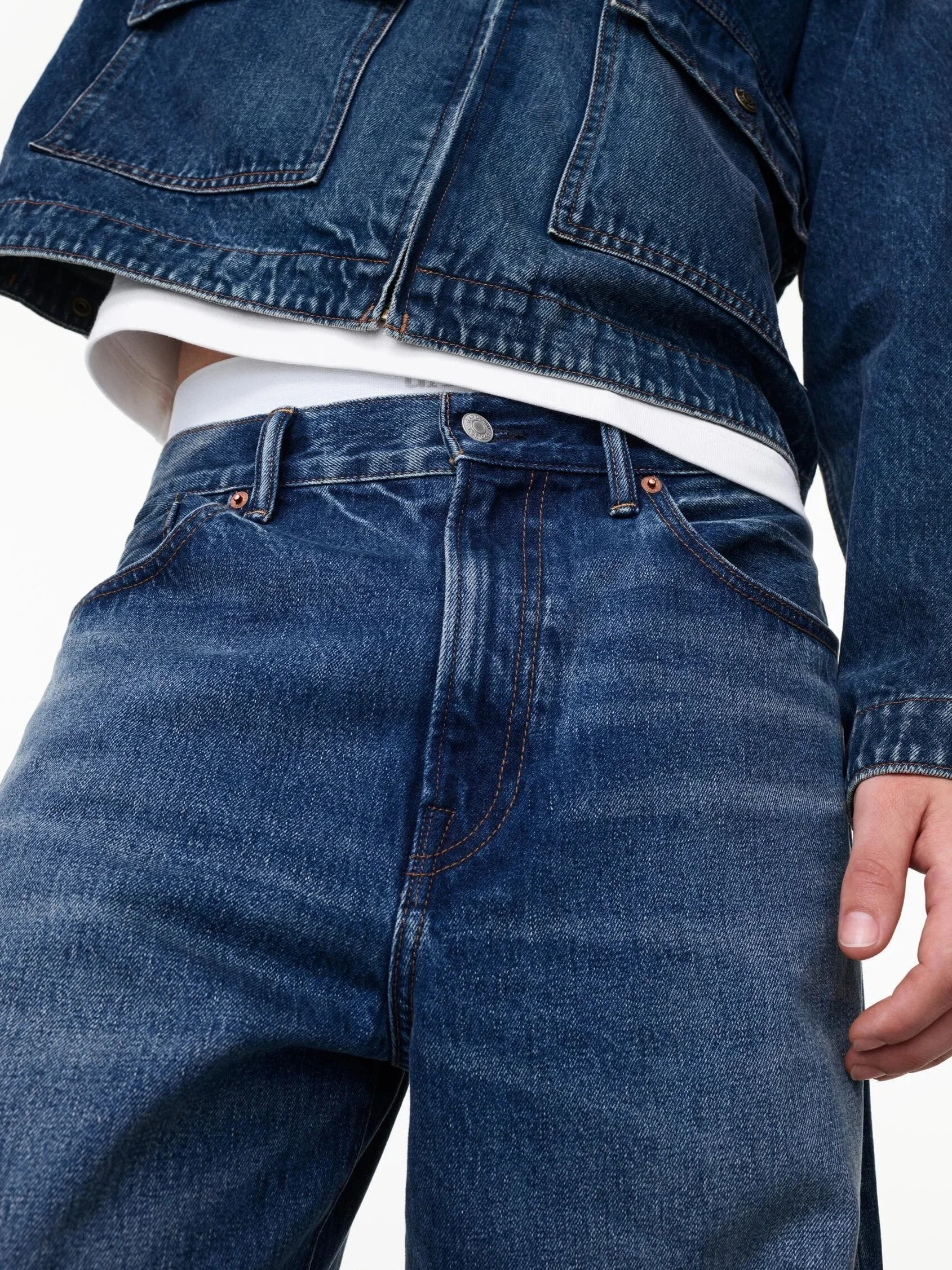
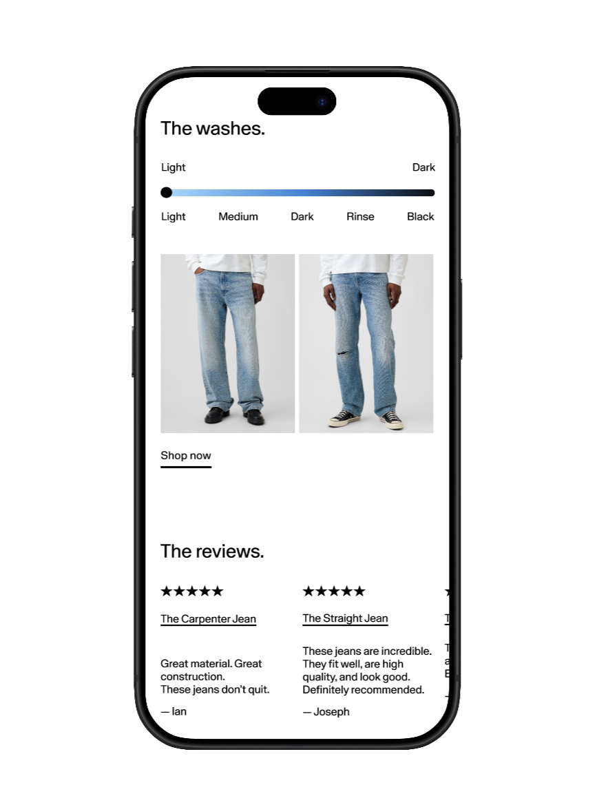
Build a look and select styles with a seamless path from product to purchase. With add to bag pop-ups.
visual education on fit, fabric and features making the category easy to understand.
4) Stylize & shop.
3) Learn.
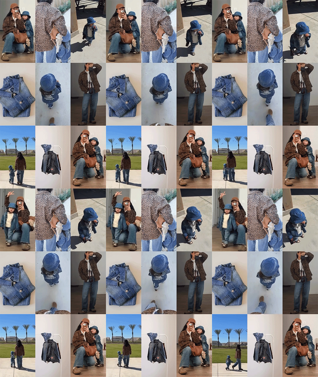
Animation, Video & Image capture.
Creative System
A complete system that mixes motion, film, photography, to bring life and soul to the styling.
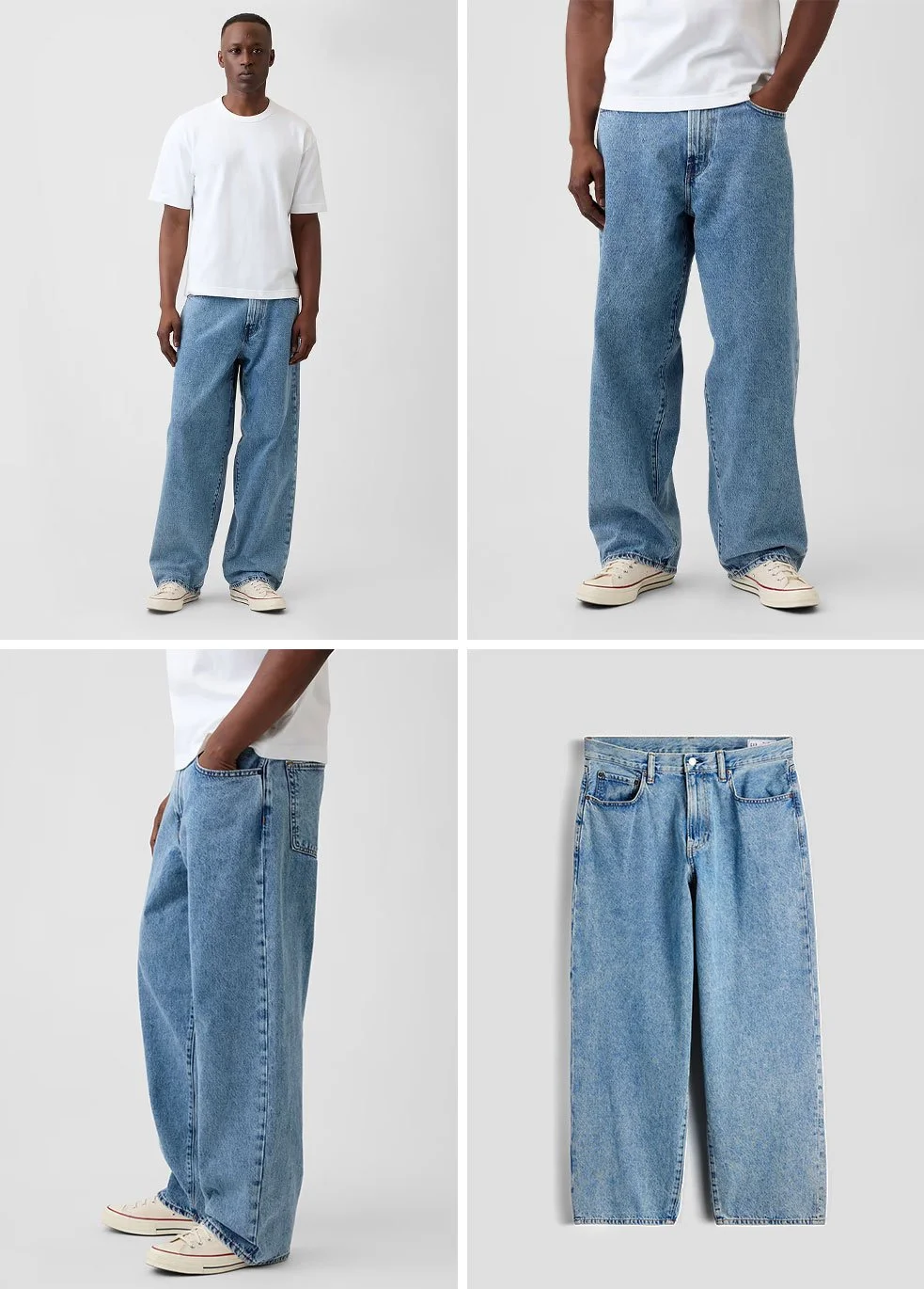
Shot Direction
Clean lighting, neutral backgrounds, and considered framing create a cohesive look across the guides.

Video
Each guide with a lead video to showcase color, range or product as well as a heroic Gap moment to draw the customer in.
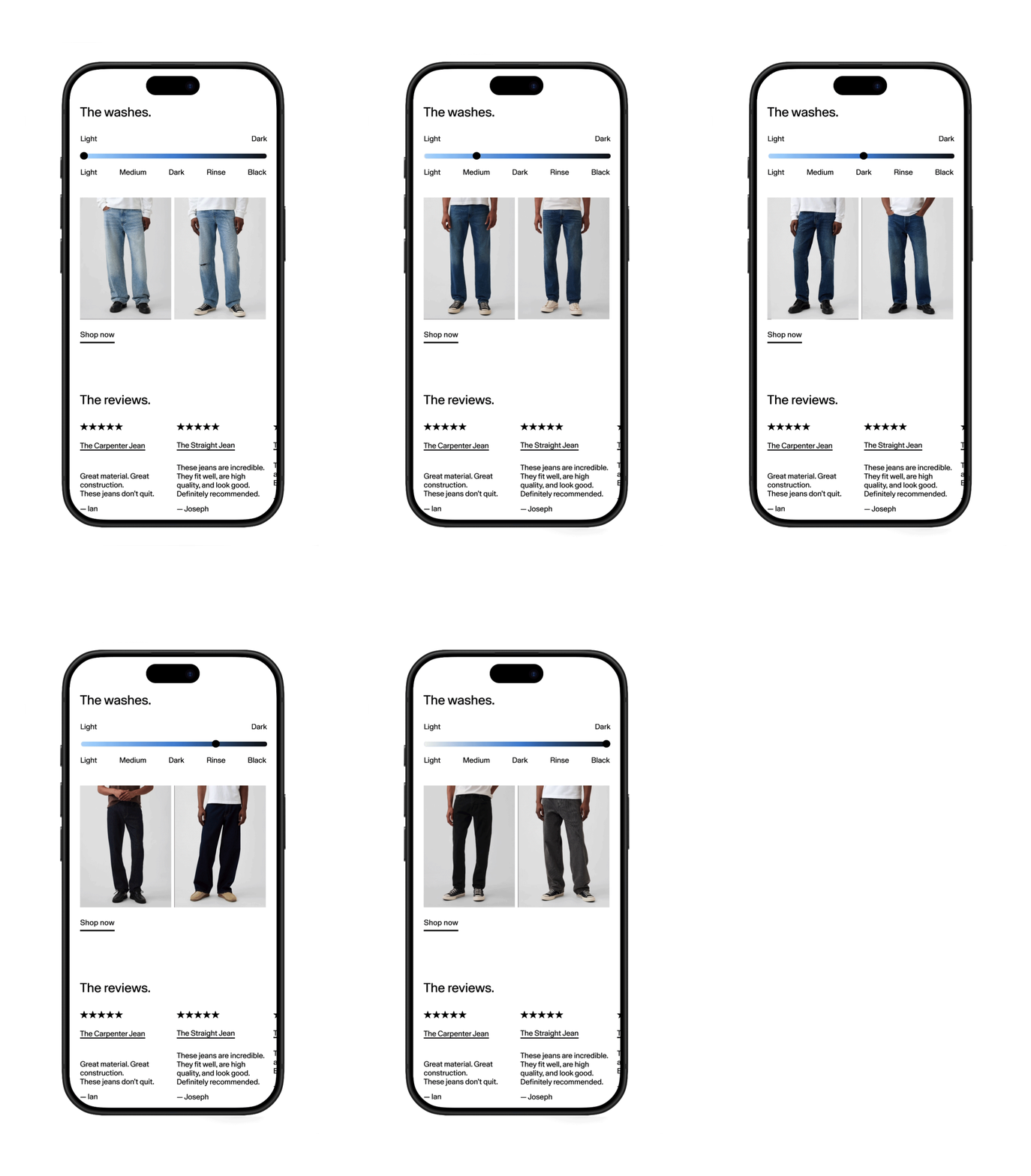
Animation
Purposeful motion that adds clarity and flow. Including selection outlines & color highlight as well as 360 motion capture.
Design System
A Flexible Framework.
Modular Grid
A consistance flexible system that scales across categories.
Clear Navigation
Simple and intuitive direction with best in class User Experience.



Customer Centric
Simple and intuitive direction with best in class User Experience.
Utilitarian Interaction
Simple and intuitive direction with best in class User Experience.
Best Practices
Accessibility for all.
✔ AA Accessibility compliance
✔ High contrast & legible typography
✔ Keyboard & screen reader support
✔ Clear focus states & touch targets
✔ Descriptive labels & alt text
Mobile: 320 - 768px
4:5 Hero 1:1 Product
Tablet: 768 - 1440px
16:9 Hero 4:5 Product
Desktop: 1440 - 2080px
16:9 Hero 4:5 Product